TechnipFMC
Visual Identity, Business Tools and Templates, Marketing Campaign Creative
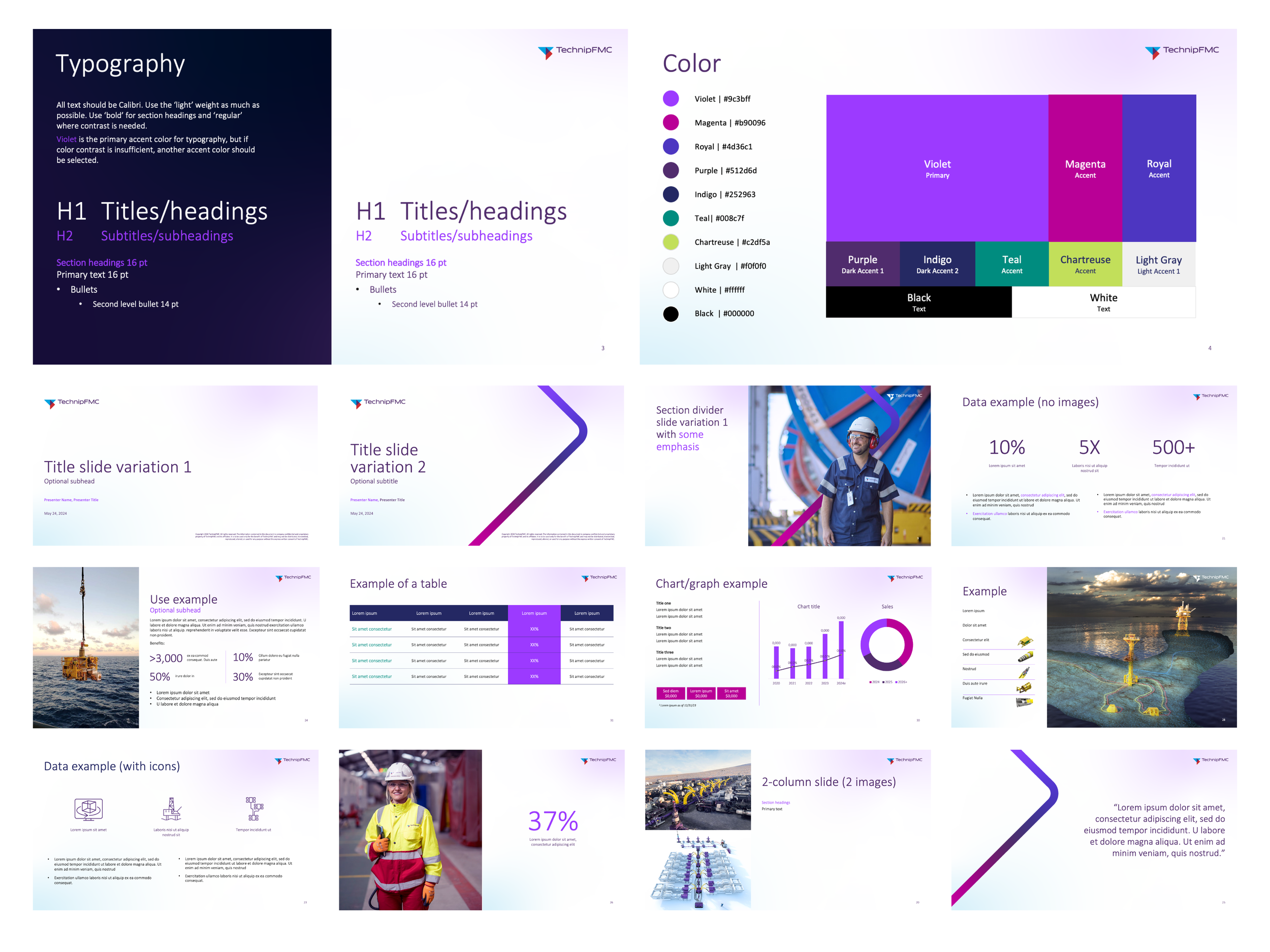
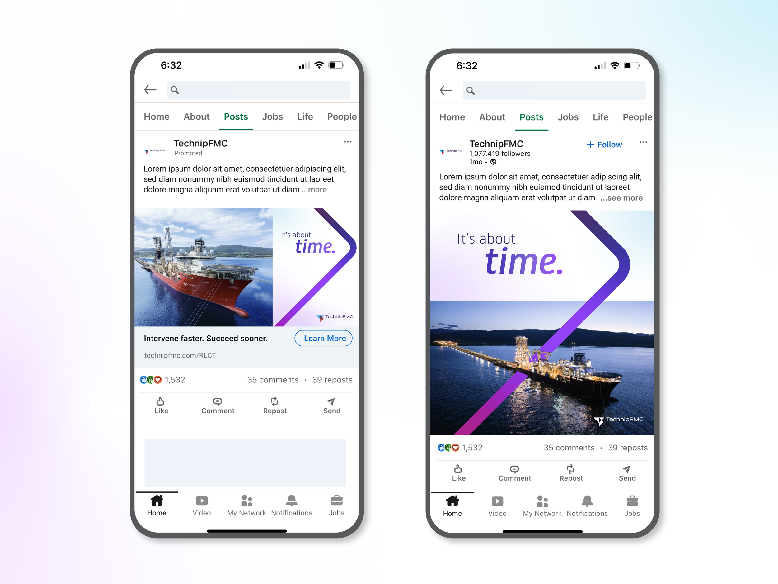
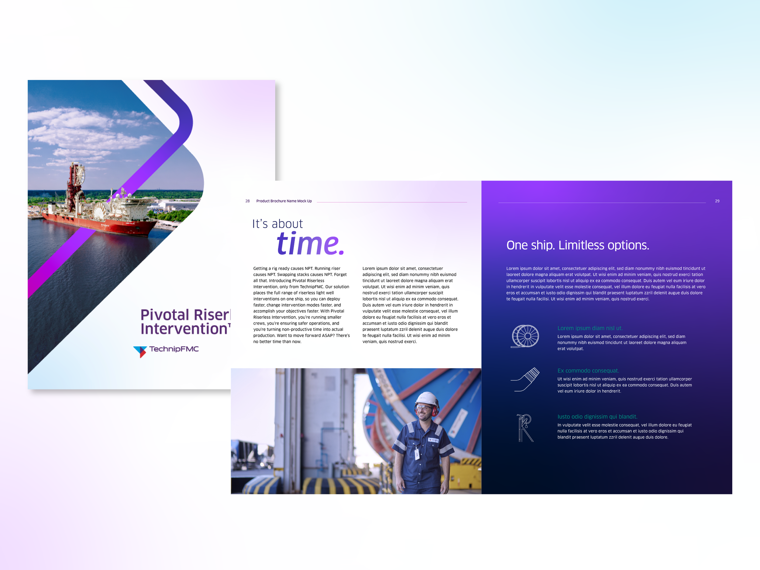
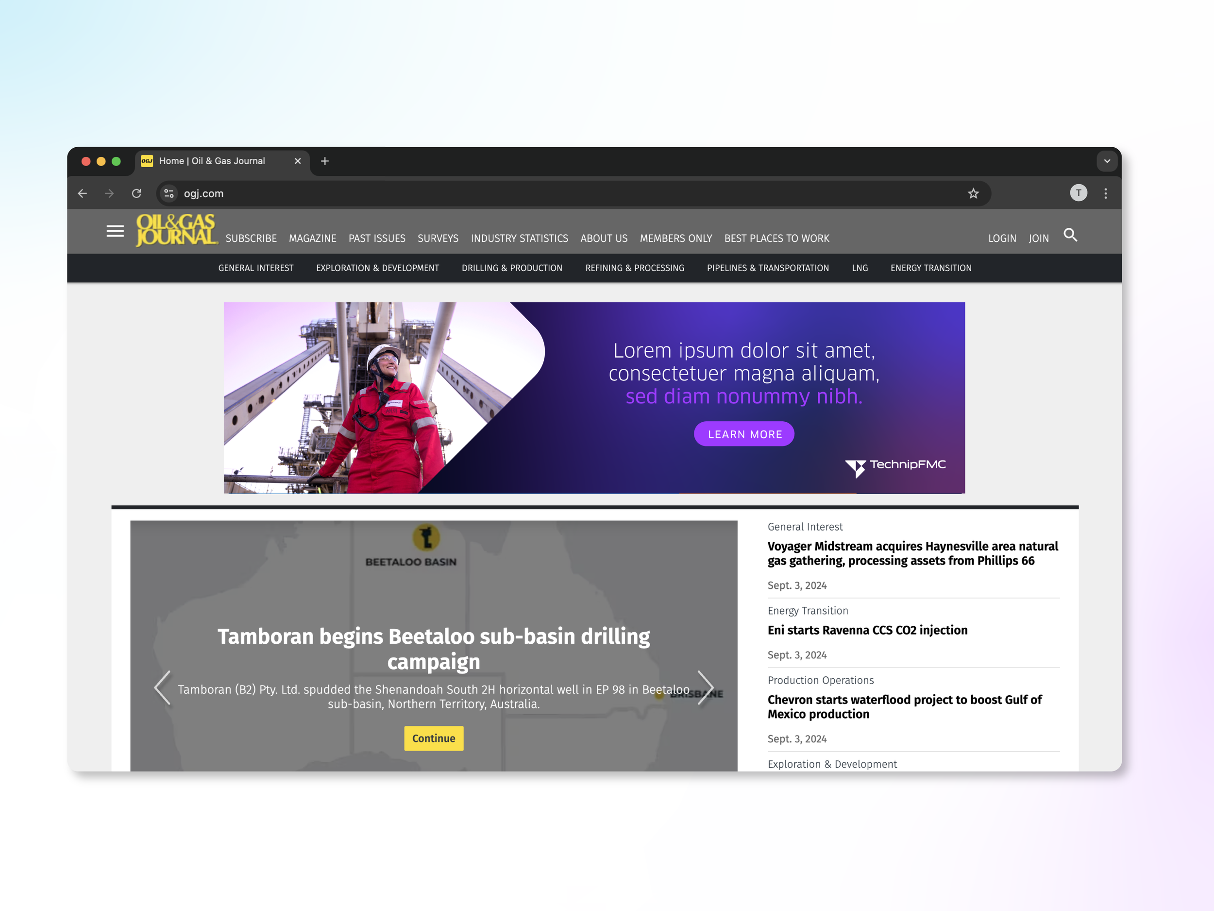
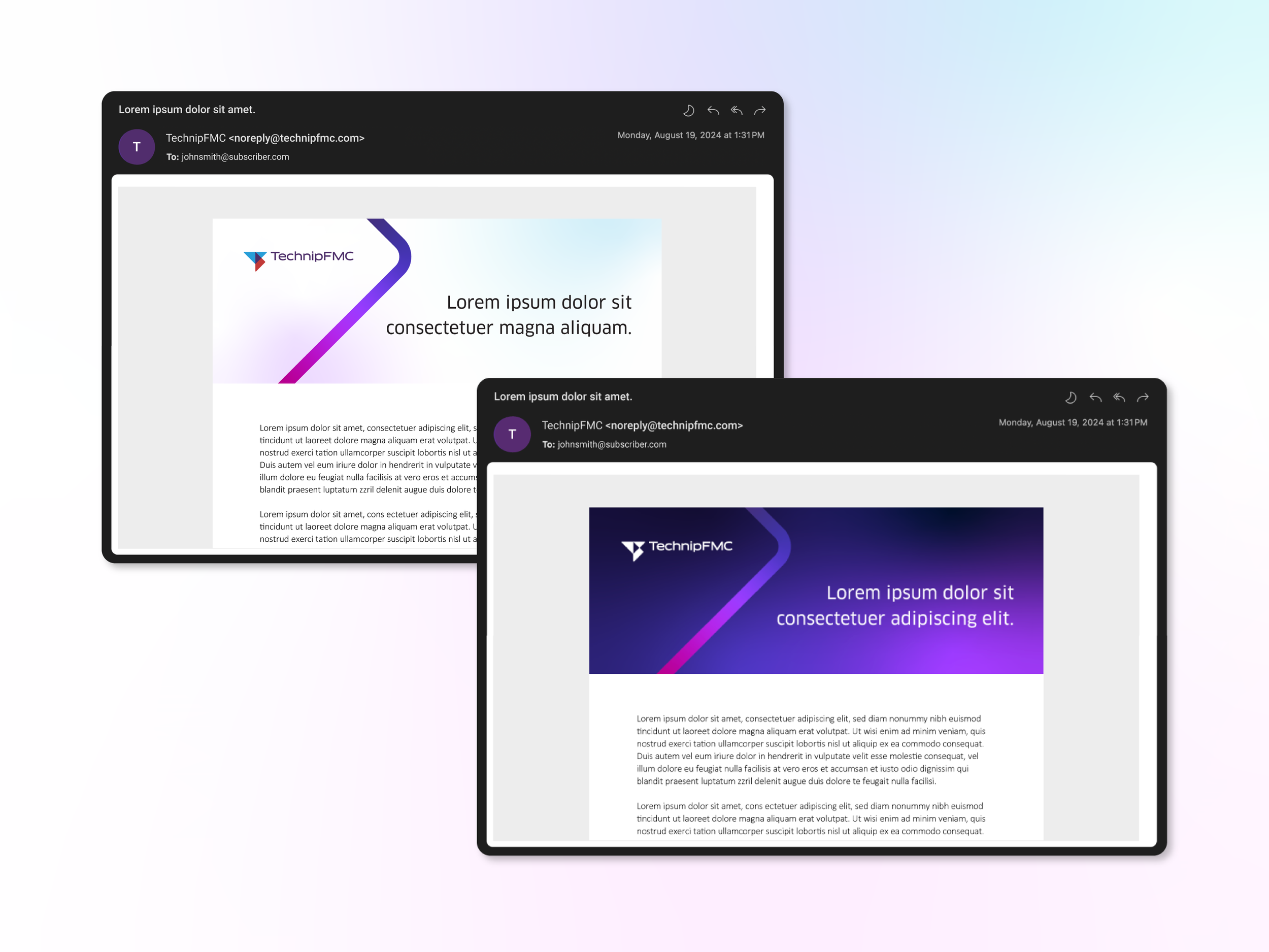
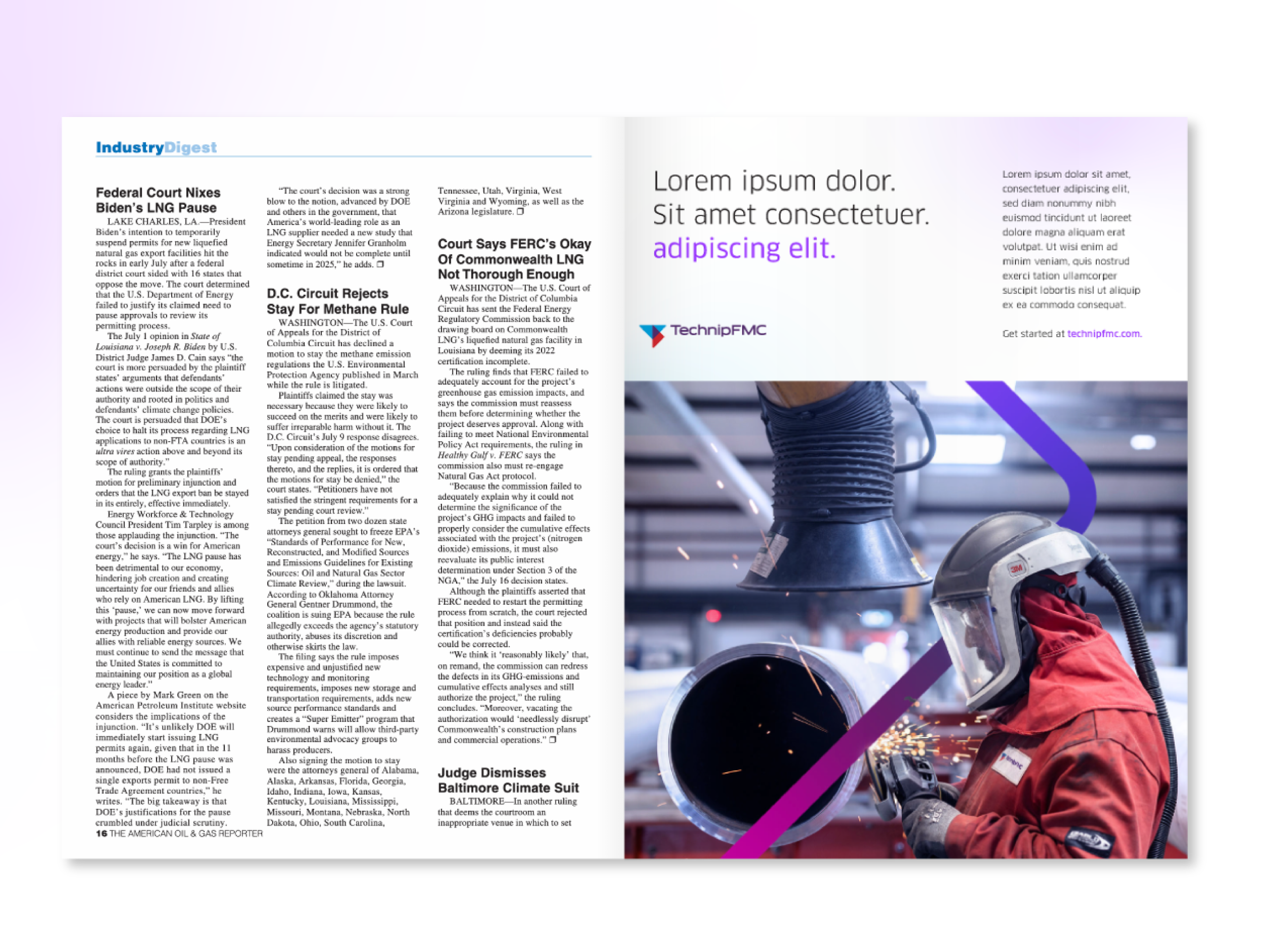
TechnipFMC aimed to modernize their brand while preserving the core of their existing visual identity. We supported this evolution by expanding and adapting their color palette, placing a stronger emphasis on purple—a distinctive differentiator within their industry. Subtle refinements to typography and photographic treatments helped unify and elevate the overall aesthetic. To further refresh the visual language, we introduced a new graphic element: “the arrow.” Starting with a PowerPoint template, we gradually extended this updated look across various campaigns and media.